shoestring reno: painting the home office
I’m kicking off the home renovations series of entries by showing you what a difference a coat of paint makes.
I know that you’re expecting kitchen renovation news, but I don’t have them yet. I’m just doing my homework and research and trying to figure out what goes where and when. When there’s something to report, like hey, our half-wall has been removed and that opens up the kitchen area, I’ll give you a full report.
For the moment, however, it’s researching things like cabinets (Ikea), countertops (hopefully honed marble), appliances (let’s pray they fit), and some other stuff.
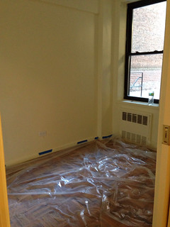
Last weekend, however, we kicked off the “shoestring reno” project (its official name since we’re trying to do this for as little money as possible) by painting the tiny home office adjacent to the kitchen. We aren’t yet sure how this room will be laid out – it really is super tiny – but hopefully, with a little ingenuity and some built-in shelving (down the road), it will make for a great, cozy little space.
One of the reasons we decided to paint this room is because it doesn’t get much light at all. Sure, it might look well lit from the pictures, but in reality – it’s quite dark. This is where the lens definitely makes something look better than it is in life.
Anyway, dark room and this horrible yellowish cream paint color that made the whole room look like this is where everything that’s alive and beautiful goes to die. In fact, I should say that the entire apartment is painted in this horrible, lifeless color.
Why did they do it? WHY???
At the paint store while picking up my supplies, a young couple was also set on painting their bedroom that weekend. I overheard them complaining to the store clerk that their whole apartment was painted in this sickly looking yellowish paint.
“I look like I have jaundice when I’m in there,” the young woman said.
“It’s deathlike,” agreed her husband.
There was some solace in knowing we weren’t alone in battling the soulless off white paint. But it still didn’t answer my question: why is it the color of choice for landlords and home sellers? Does anyone actually like that color?
When we got to the apartment, Andrew and I laid out the tarp, taped the corners with painters tape, changed into our painting clothes. Then we cranked up Andrew’s iPhone as loud as it cold go and took to painting.
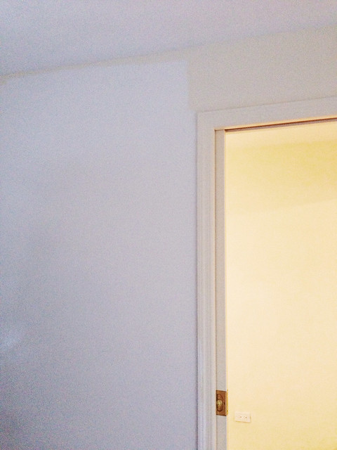
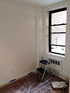
The results were, well, look.
The “before” and “after” right next to one another.
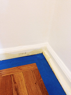
And there, look, this is just what a corner looked like up close before…. and after.
See what I mean? A few hours. One coat of paint. One amazingly different looking room. The kind of room that might actually serve as inspiration and create, rather than destroy, energy.
For anyone interested, we used Benjamin Moore self-priming semi-gloss paint in “Super White”. It proved to be rather time consuming and difficult to procure low VOC paint, so we kept the window open in the room while we worked and hoped for the best.
Also, I created a new section on the menu in the top left called “Shoestring Reno”. If you want to find all of the entries for our home renovations, they will all be there in one place.


Tiff in Minnesota
Seems to me the trend was to use “Antique White,” as it was a warm white, and went with everything. People didn’t used to be so brave about using color on their walls, and especially with rentals, Antique White was a very acceptable color. Not so harsh, yet clean, and still white. And they could paint every room the same.
Now, the trends have changed, and having a bright wall, or many bright walls is more acceptable.
Times change, and here you are, with a whiter brighter space. Looks great! Good luck with the reno!